
The Colours of 2024
As we move into 2024, the interior design world is witnessing a significant shift in colour preferences, moving away from all-neutral palettes and embracing the bold and beautiful spectrum of jewel tones. As a modern furniture store in Calgary, Revolve Furnishings is excited to see these vibrant, deep pops of colour in our client's design goals.
Rediscovering Colour
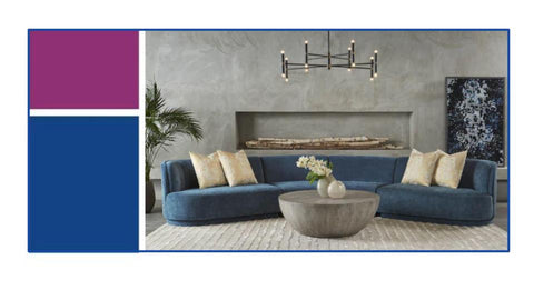
This year, the emphasis is on incorporating richness into our living spaces, whether through painting entire rooms, selecting furniture, or adding accessories in these luxurious hues. The era of monochrome and minimalist schemes gives way to an eclectic mix of amethyst, sapphire, ruby red, emerald green, and topaz or citrine yellow. This transition is not just about adding colour; it's about making a statement and injecting personality into every corner of the home.
There is a growing enthusiasm for colour in interior design, noting that jewel tones offer a compelling contrast to virtually any decor style. Whether used as an accent or as the focal point, these deep, rich colours can transform a space, giving it a sense of sophistication and warmth.
While neutrals have dominated interior palettes, the dynamic relationship between these subdued shades and the intensity of jewel tones creates a visually stunning effect. This contrast is especially pronounced in the fall, but as we've seen, jewel tones are quickly becoming a year-round staple within the home.
Even paint brands are embracing this trend, reflecting a preference for colours that complement jewel tones. These selections highlight the versatility of these vibrant hues and their ability to pair beautifully with a wide range of accent colours.
Timeless Elegance

Neutral tones such as beige, ivory, and taupe remain perennial favourites. Their ability to instill a space with a sense of calm and sophistication is unmatched, offering the perfect backdrop for any room's aesthetic.
Opting for furniture in these shades, from modern sofas to dining chairs, ensures a timeless elegance that seamlessly integrates with various decor styles.
Earthy greens echo the natural world, bridging the gap between the outdoors and the interior space. Along with orange, brown, and natural textures, these hues embody a style that transcends temporary design trends.
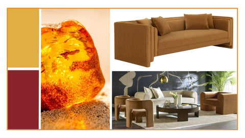
The earth itself inspires a palette that includes not only vibrant greens but also whites, stone grays, and sandy beiges, creating a harmonious blend that can enhance any home. Organic elements allow for effortless pairing with existing decor, providing a subtle yet captivating visual interest that softens and enriches the surrounding environment.
Our Design Expert Tips
- Jewel tones are a great colour palette that works exceptionally well for winter. However, if you want a look that will last all year, pair the icy colours with warm tones to transition through the seasons.
- Neutrals pair well with bright emerald or sapphire, and amethyst and ruby red colours pair well with gold and metallic accents.
- Don't be afraid of mixing colours. You can pair deep greens and purples easily if you want to add a little drama to your space.
- Jewel tones can fit various design styles. If you like sleek & modern, transitional or contemporary, you can make jewel tones work beautifully.
Explore 2024 Colour Trends at Revolve Furnishings
In 2024, whether you embrace jewel tones boldly or subtly, the key is to have fun and explore the possibilities these colours offer. As a modern furniture store in Calgary, we believe that the colours of 2024 highlight essential design elements that will bring lasting beauty and comfort to your home. Look at some of the mood boards our designers have created for our favourite colour palettes and trends that you can incorporate into your living room furniture, bedroom, office, and any space in your home.
At Revolve Furnishings, we're excited to see how our customers bring this trend to life in their own homes. Join us in celebrating the richness and diversity of jewel tones, and let's transform our living spaces into lush, vibrant sanctuaries. Visit our showroom at 7070 11 Street SE.
Leave a comment
Comments will be approved before showing up.
Also in Revolve Blog

Home Lighting Ideas Calgary: Why Layering Your Lighting Changes Everything
If you're searching for home lighting ideas in Calgary, understanding the three essential types of lighting—ambient, task, and accent—is the perfect place to start.

Room to Gather | How to Choose the Right Dining Table Size for Your Space
